
Blog / January 2022
-
17 January 2022Prototypes for a better homepage dashboard !
The homepage is long overdue for an update!
I've decided to reorder my todo list, and make it a priority for the next update(s) to improve the homepage dashboard so it is more useful as well as a less confusing experience for new users.
Last week I spent time mostly in Figma. It was productive and although the new design is relatively simple, I feel like the major elements are in place, and I'm eager to start implementing!
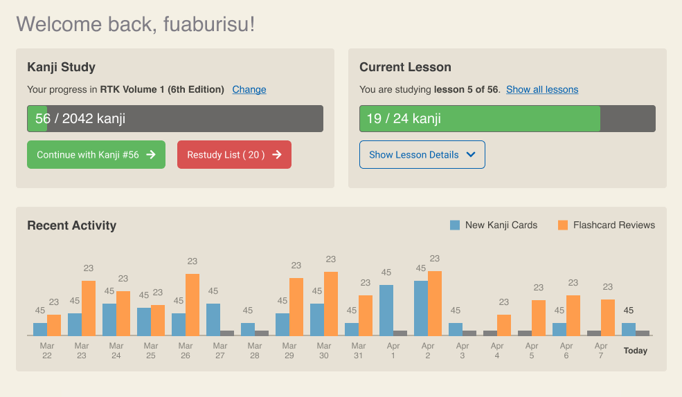
It's really hard for me to work on just "wireframes" (ie. just boxes and lines), so the prototype has colour and is relatively close to what I am going for. But also please keep in mind it is not finished -- it's a bit bland visually, and there is plenty of room to iterate in following updates.
Please check out the New homepage dashboard prototype discussion.
In this thread I go more in depth about what we are trying to solve, and how the new design would improve the user experience.
Now is a great time if you'd like to be able to give your input, and let me know what you think. Have I covered most user's needs with this new dashboard? Did you imagine something else? Any input is welcome and I may tweak the implementation accordingly.
-
6 January 2022Today's update: Improvements to the documentation
Happy New Year everybody!
This first update in 2022 brings small but welcome changes to the Learn More page (which I shall refer below as the "Help" page to simplify).
My goal initially was to document the new Again rating. See Card ratings section.
I recommend anyone using the SRS to re-read this part of the documentation! I updated the documentation of the Hard rating, and consolidated information from previous site updates that wasn't clearly documented before.
As I did this, I thought it was time to improve the documentation. It now finally has a multi-level table of contents. I hope you'll agree it is way, wayyyy better. You can now see what's in the documentation at a glance. The Help page TOC automatically picks up headings from the source document, which is written in Markdown.
In no particular order a list of changes:
- the Card Ratings section now has coloured buttons which look the same way as they do in the Review screen
- documented the Again rating
- consolidated two tips in the Hard rating documentation
- added a new Edit Stories section : this is essentially the same information that was shown when you go to the Study page, but it wasn't very obvious there -- as evidenced by occasional emails from users asking "How do I format the keyword".
- added a new Edit Keywords section
- rearranged some bits like Restudy List and Review Summary under the main "Reviewing" section
- in Review Chart Colors I replaced old GIF images with CSS for rendering the small isometric boxes. Sometimes it's the simplest changes that are satisfying... they look way nicer than the old icons -- and probably look much sharper on high resolution displays
The Help page link was added directly into the top bar navigation (on desktop).
Then I looked at the odd "hamburger icon" drop down which featured the "Help" and "Contact" links. I thought it doesn't really make sense. Typically the hamburger icon is used on mobile devices when there is not enough space for a wide navigation bar. Users are pretty used to it and know it is a kind of menu. However on desktop when there is enough space I figured it would make more sense to put an actual label.
In the "More" dropdown, I removed the "Help" link since it is now prominent on the top navigation bar (no changes to the mobile nav).
I added a Discussions link, which takes you to the Github Discussions page -- a place where you can post suggestions, bugs and asks questions.
With that said, I know the documentation could still use a lot of work. I originally only intended to add information about the new Again SRS rating -- and then went from there. Writing documentation is hard, and very time consuming. I think it's pretty decent as it is. If some parts of the documentation are really an eye sore let me know and I will see what I can do :)
Next up
In the coming weeks I am planning to redesign the "progress bar" area of the Review page -- which is not very intuitive since I added the Again SRS rating.
I need to look at that and at the Review Summary page at the same time since both essentially need to show a breakdown of No/Hard/Yes/Easy answers -- in a simple, readable way.
This time I'll try to put the keyboard away and go back to the drawing board. Im general I feel I did the best updates on the site when I took the time to design the page in FIGMA (or Photoshop, years ago). It's always worked the best for me. Having a clear visual representation of what I'm trying to implement, even if it is a static image, lets me see right away all the things that sound great on paper but don't actually work. Then, once I dive into the code I have a super clear idea of what I'm going for, and it's way more fun to code when you don't have doubts and you don't waste time going in circles.
I'm still mulling over it. The main thing that came to mind is that due the the flexible functionality of the Hard ratings, we can not assume (as is the case now) that the Hard rating is a succesful review. If the user changes "Maximum box for cards marked 'Hard'" in the SRS settings, it can work similarly to the Again rating -- without the repeated review.
So I'm thinking of breaking down answers in 3 groups : Failed / Hard / Yes + Easy. Red, orange (or yellow) and green. So both during review and on the review summary the breakdown could be shown in these 3 groups. That way the Hard answer can mean whatever the user wants, depending how they use it.
Note this doesn't change anything to the ratings -- it's just a question of how to more intuitively represent the breakdown of a review session.
By Month
- Apr 2024 (2)
- Mar 2024 (1)
- Feb 2024 (1)
- Dec 2023 (1)
- Nov 2023 (2)
- Oct 2023 (2)
- Apr 2023 (2)
- Mar 2023 (2)
- Feb 2023 (1)
- Jan 2023 (2)
- Dec 2022 (1)
- Nov 2022 (2)
- Oct 2022 (3)
- Sep 2022 (1)
- May 2022 (4)
- Apr 2022 (1)
- Feb 2022 (2)
- Jan 2022 (2)
- Dec 2021 (4)
- Nov 2021 (2)
- Oct 2021 (2)
- Sep 2021 (2)
- Aug 2021 (1)
- Apr 2021 (2)
- Feb 2021 (3)
- Jan 2021 (3)
- Dec 2020 (1)
- Nov 2020 (1)
- May 2020 (1)
- Apr 2020 (1)
- Jan 2020 (1)
- Oct 2019 (1)
- Sep 2019 (1)
- Aug 2019 (4)
- Jul 2019 (3)
- Jun 2019 (1)
- May 2019 (1)
- Mar 2019 (2)
- Jan 2019 (1)
- Nov 2018 (3)
- Oct 2018 (8)
- Sep 2018 (4)
- Aug 2018 (3)
- Jul 2018 (1)
- Jun 2018 (4)
- May 2018 (1)
- Apr 2018 (1)
- Mar 2018 (1)
- Jan 2018 (1)
- Dec 2017 (6)
- Nov 2017 (4)
- Oct 2017 (4)
- Sep 2017 (5)
- Aug 2017 (5)
- Jun 2017 (3)
- May 2017 (2)
- Apr 2017 (3)
- Mar 2017 (7)
- Feb 2017 (10)
- Jan 2017 (11)
- Dec 2016 (6)
- Nov 2016 (5)
- Oct 2016 (6)
- Sep 2016 (7)
- Aug 2016 (3)
- May 2016 (1)
- Mar 2016 (2)
- Jan 2016 (1)
- Dec 2015 (3)
- Nov 2015 (1)
- Oct 2015 (1)
- Sep 2015 (7)
- Jul 2015 (2)
- Jun 2015 (1)
- May 2015 (5)
- Apr 2015 (4)
- Mar 2015 (5)
- Feb 2015 (4)
- Jan 2015 (5)
- Dec 2014 (4)
- Nov 2014 (3)
- Oct 2014 (2)
- Jun 2014 (1)
- Apr 2014 (2)
- Mar 2014 (4)
- Feb 2014 (3)
- Jan 2014 (4)
- Dec 2013 (2)
- Oct 2013 (1)
- Sep 2013 (1)
- Jun 2013 (4)
- May 2013 (1)
- Mar 2013 (1)
- Jan 2013 (2)
- Oct 2012 (2)
- Aug 2012 (1)
- Jul 2012 (2)
- Jun 2012 (2)
- May 2012 (1)
- Mar 2012 (2)
- May 2011 (1)
- Apr 2011 (4)
- Mar 2011 (3)
- Feb 2011 (2)
- Jan 2011 (2)
- Dec 2010 (8)
- Nov 2010 (8)
- Oct 2010 (3)
- Sep 2010 (3)
- Aug 2010 (1)
- Jul 2010 (2)
- Jun 2010 (5)
- May 2010 (1)
- Apr 2010 (3)
- Mar 2010 (4)
- Feb 2010 (2)
- Jan 2010 (1)
- Dec 2009 (5)
- Nov 2009 (5)
- Oct 2009 (1)
- Aug 2009 (1)
- May 2009 (5)
- Apr 2009 (2)
- Mar 2009 (1)
- Feb 2009 (2)
- Jan 2009 (2)
- Nov 2008 (1)
- Oct 2008 (1)
- Sep 2008 (1)
- May 2008 (2)
- Apr 2008 (1)
- Feb 2008 (6)
- Jan 2008 (5)
- Dec 2007 (6)
- Oct 2007 (1)
- Sep 2007 (2)
- Aug 2007 (3)
- Jun 2007 (1)
- May 2007 (5)
- Apr 2007 (1)
- Mar 2007 (2)
- Feb 2007 (1)
- Jan 2007 (4)
- Dec 2006 (3)
- Aug 2006 (1)
- Jun 2006 (3)
- Apr 2006 (6)
- Mar 2006 (8)
- Feb 2006 (1)
- Jan 2006 (4)
- Nov 2005 (1)
- Oct 2005 (4)
- Sep 2005 (1)
- Aug 2005 (11)